Showing posts with label gnuplot. Show all posts

Sunday, July 26, 2020

Enviromental Sampling of Volatile Organic Compounds


adafruit, bee, bee keeping, gnuplot, sparkfun, volatile organic compounds, cloake board, olfactory fatigue, reproducibility

adafruit, bee, bee keeping, gnuplot, sparkfun, volatile organic compounds, cloake board, olfactory fatigue, reproducibility
During past and this summer, I have been able to smell the backyard hives, but the human nose is not designed to quantify or map a smell - see this link about Olfactory Fatigue.    Here's how I compared the smell of 3 hives and compared each hive smell to background using a Volatile Organic Compound (VOC) sensor.

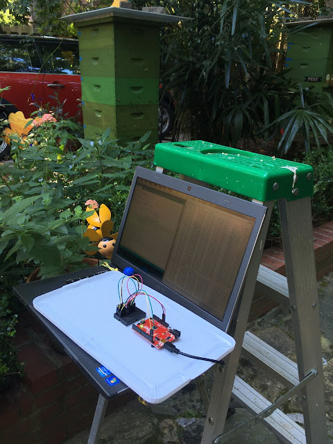
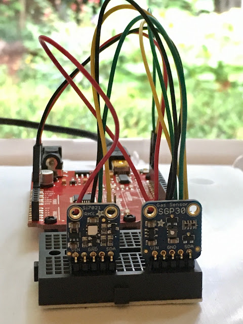
I purchased 2 breakout boards by adafruit, one measures VOC concentration and the other measures temperature and humidity. Seen in the photos:
  • two breakout boards plugged into a mini stick-on breadboard
  • red colored sparkfun arduino microprocessor attached to an upside down white plastic storage lid using black nylon standoffs by adafruit
  • a mini serial cable connecting the microprocessor and laptop
  • laptop attached to the ladder's paint-tray using a bungee cord
 adafruit, bee, bee keeping, gnuplot, sparkfun, volatile organic compounds, cloake board, olfactory fatigue, reproducibility
My first backyard environmental measurement of VOC was meant as a dry-run, but luckily I did not need to modify my experiment design:
  • chalk marked or flagged a 6 x 4 grid surrounding 3 hives - 4 grid points are skipped due to large shrubs
  • selected a day with no wind so as not to disperse the VOC which pool near the hives
  • selected an evening to avoid when most flowering plants produce VOC
  • warmed-up the sensor system outdoors for an hour before sampling
  • setup at a grid point, and sampled for 60 seconds. I stepped away from the 6 x 4 grid during sampling as my body both produces and disperses VOC
  • after sampling 20 grid points, I repeated the first 5 grid points to examine reproducibility
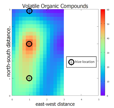
A few words of explanation regarding the map of VOC surrounding 3 backyard hives:
  • VOC are shown in parts per billion (ppb) units.  As I do not have access to a reference gas mixture, you can think of these VOC values as relative values.
  • The central (middle) hive had the highest concentration of VOC.  This hive is a massive stack of boxes with 2 queens separated by a cloake board.   On the bottom of this stack is an over wintered hive.   On the top of this stack is a medium size swarm catch (March 23, 2020).
  • A VOC plume from the central hive merged with the hive shown at the bottom of the map.  The hive at the bottom of the map is a large overwintered hive.
  • The hive at the top of the map is inconsequential in VOC production and resembles a background value.  This hive is a tiny swarm catch (March 13, 2020).
Sunday, September 26, 2010

IPM counting board debris map

bee, beekeeping, counting board, debris, gnuplot, ipm, map, pollen, propolis, screen, Small Hive Beetle, wax,
Each week I removed the IPM counting board and drew the outlines of the counting board debris into my journal.  The debris consists of wax, pollen, propolis and other items like the occasional small hive beetle.  After cleaning off the debris, the counting board is returned to the hive.  I transferred  my journal debris maps into a spreadsheet grid where I (one or zero) scored the presence or absence of debris.  The debris mostly lands along blurry east-west lines which relate to the bee space between frames.  Probably most of the blurring of the debris is attributed to:
  • debris falling off the bees as they bounce in and out of the hive entrances above the screen 
  • debris bouncing or rolling on the screen
  • debris moved by ants or wax moth larva beneath the screen on the counting board
To sharpen the debris map blurring, I used a moving 3 week sum which creates a debris map with three intensities.  All of my work is done twice, as I follow two side-by-side hives that were started this year. So, what story might describe these gnuplot contoured debris maps?
  • In the beginning, the debris tends to be concentrated near the hive entrances which face west.
  • Over may weeks the debris concentration moves east away from the hive entrances and also north.   The two hives consume syrup at different rates, have different flight activity and have different weekly debris maps.  However, both hives show the same overall shift of debris concentration when measured over many weeks. 
Where will I find the debris concentrated this fall?  What about this winter?  What about next spring?